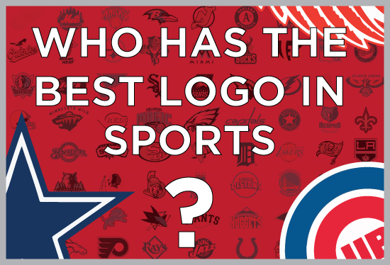
Who Has The Best Logo in Sports? You Decide
WANT TO SEE MORE LIKE THIS?
Sign up to receive an alert for our latest articles on design and stuff that makes you go "Hmmm?"

Creating a good logo is one of the top priorities for an organization’s branding strategy. Recently, there has been a trend in the NFL– evolving team logos. Five NFL teams (Panthers, Jaguars, Dolphins, Vikings, and Seahawks) have updated their logos as recently as 2012. Maybe the Panthers and Jaguars think new logos will help their fans forget about how bad their teams are? Like other commercial entities, professional sports teams spend a lot of time on designing their team’s logo. While a team’s logo may have nothing to do with whether or not their team wins or loses, having a memorable logo can create brand recognition that is priceless and commercialization that’s worth a lot too. We want to see which team from the four major sports in the United States (NFL, NBA, MLB, and MLS, NHL) has the best logo. We’ve narrowed the field down to the sweet 16 but now we need your help. (**UPDATE NOW DOWN TO ELITE 8) View the Elite 8

![]()
click above to enlarge
Did your team make it to the final 16? If not, did it deserve to? Tell us why in the comments on the bottom of this page.
Format of brackets
In order to determine which team has the best logo we created a 128 team-bracket of the four major sports in the United States. While it’s up for debate whether or not hockey is a major sport (sorry hockey fans but its true), for the purpose of having a super-sized March madness style bracket, we considered the NHL as one of the big four. For soccer/any other sports fans: while soccer (and other sports) might be more popular worldwide, it is not even close in ‘murica. Like March madness, there are four regions but instead of geographic locations for each region, each professional sports league represents one region. Teams from the same league will go head-to-head until you help us crown the winners from each league. Once we arrive at the final four with your help, we will have teams from different sports go head-to-head to crown one team as having the best logo in sports.
How the seeding works
There have been many iconic logos in the past like the Milwaukee Brewers logo from 1978-1993 and the Utah Jazz logo from 1979-1996. Likewise there have been some very infamous logos in the past like the Cleveland Cavaliers logo from 1994-2003 and the Seattle Mariners logo from 1987-1992. However for this experiment, we only looked at each team’s current logo. We seeded each team by the number of years they have had their current logo. The team that has had the logo for the longest time received a one seed while the team with the newest logo received a 16 seed. Each sport has a championship matchup so each league was divided into conferences just like they are in their league. For example, the NBA is split into the Eastern and Western conferences. The winner of the East faces the winner of the West in the NBA finals. We gave separate seedings for the East and the West with 16 seeds each. The number one seed in the East was the Chicago Bulls (1966) and the number one seed in the West was the Sacramento Kings (1994) since they have had their current logos for the longest time in their respective conferences.
Voting criteria:
The criteria for voting are difficult to define. Our goal is to find the best sports logo without any biases but we know that’s impossible. Once the matchups were set, we had everyone on our entire staff vote on each matchup.
Here are the criteria that we used to come up with the sweet 16:
1. Test of time: Has the logo been around for a long time and/or will it last for years to come?
2. Representative: Does the logo represent the city that it’s from?
3. Overall: We’re designers so we’d like to think we know a thing a two about logo design. Does this logo look good?
4. Intimidation: Is this logo fierce?
5. Merchandise: Is this the kind of logo people want to purchase and wear?
We are down to the Elite 8. Each sport is down to two teams giving us 8 in total. View the Elite 8
Vote Now for the remaining teams.
A recap of the early round match-ups
![]()
click above to enlarge
Remaining Football teams:
Cowboys (1964): America’s team’s logo may be the most identifiable in sports, which may explain why it has made it this far. The simple design has stood the test of time and has not changed in nearly 50 years. The Cowboys dominated their way to the NFC championship.
Seahawks (2012): The Seattle Seahawks have been a popular pick on the field this year. Not only are they popular on the field but also in the logo department. The blue and grey combination with the subtle green makes for one of the best color combinations.
Broncos (1997): The Denver Broncos logo somehow looks like John Elway leading his team on a game winning drive (Even though Elway was only around for a short time with this logo). The Broncos squeaked by the Bengals but dominated the Patriots in a contest most would like to see on the field.
Texans (2002): The NFL’s newest franchise has one of the best logos. The bull with patriotic colors and the Texas star for an eye is unique and screams Texas.
Analysis:
The Oakland Raiders had to be one of the favorites going into the NFL bracket. Their logo is iconic but couldn’t beat out the Texans. A 16 seed beat a number 1 when the Dolphins beat the Chiefs. The Chiefs logo may have been around for a while but it looks outdated.
Worst of the worst: The Carolina Panthers have the worst logo in the NFL. Their most recent logo was updated in 2012 and looks like it was created by a 12 year old obsessed with glow in the dark.
A recap of the early round match-ups
![]()
click above to enlarge
Remaining Basketball teams:
Bulls (1966): This is the only Bulls logo Chicago has ever known. It is the oldest logo in the NBA by 28 years. It’s a classic case of “if it ain’t broke don’t fix it.” The Bulls dominated each team on the way to the finals of the East.
Nets (2012): The Nets move from New Jersey to Brooklyn meant creating a new logo. After receiving a lot of criticism when the logo was first introduced, the black and white logo looks classic even after only surfacing a year ago. The Nets now will try to get some playoff revenge against the Bulls.
Spurs (2002): Maybe the Spurs can get over their heartache by winning the best logo? The Spurs logo is relatively simple which can be a good thing in some cases. The Spurs might have had the easiest draw to get to the Western Conference finals.
Pelicans (2013): The Pelicans have to be the biggest Cinderella story of the tournament. What’s great about the pelicans going this far is that New Orleans hasn’t played a game as the Pelicans yet. Using the wings to surround the ball was a brilliant idea.
Analysis:
The Pelicans upset of the Lakers is the most controversial of the first round. The Laker’s logo is classic, but there is something special about that Pelicans logo. Another surprise was the Nets beating out the Celtics. The Celtics logo has been around forever and is iconic in the NBA.
Worst of the worst: The Cleveland Cavaliers logo is just boring. Maybe that’s why LeBron left the Cavs back in 2010? There’s really not much to say about the logo. If all you have for a logo is a basketball and your team’s name (the sword adds nothing), you’re doing something wrong.
A recap of the early round match-ups
![]()
click above to enlarge
Remaining Baseball teams:
Orioles (2009): The Orioles’ simple logo making it to the ALCS comes as a surprise, especially after they took down the Yankees. The cursive along with the fact that the Baltimore oriole is Maryland’s state bird make the Orioles logo very underrated (I guess not anymore).
Red Sox (2009): You know a logo is special when words aren’t necessary. Boston’s logo along with the Indians’ logo are the only two baseball logos without any letters. The Bahsten Red Sahx dominated on the way to the ALCS.
Cubs (1979): The oldest logo in the national league, the cubbies have kept it pretty simple. The big “C” has two purposes to represent Chicago and also complete the word “Cubs”. The Cubs’ only real competition came against the Dodgers but they moved on comfortably.
Cardinals (1998): The Cardinals’ logo is almost identical to the Orioles. A bird standing on top of the name of the mascot seems like a pretty good formula for logo success. The Cards will face off against their rival, the Cubs, to advance to the World Series.
Analysis:
The Yankees are the most famous baseball team in the world and thus have a very recognizable logo. They have had their current logo since 1947. Even that wasn’t enough to take out the simple Orioles design. One logo that is underrated is the Kansas City Royals. Their logo is basic but the crown on top of KC is a nice touch. Unfortunately for them, they went against the sahx in the first round.
Worst of the worst: Not only are they Houston Astros the worst team in baseball, their logo is pathetic.
A recap of the early round match-ups
![]()
click above to enlarge
Remaining Hockey teams:
Devils (1999): The Devils logo is awesome. When you first look at it you can’t really see what it is. But after a second, you realize it is an “N” and “J”. But this isn’t a regular “J”; It has horns and a stake like a devil. Well done. They had a tough draw on the way to the East Finals. They had a close one with the Maple Leafs and Bruins.
Flyers (1967): The Flyers logo is almost 50 years old but still looks fresh. It is a puck with wings on it’s back, which also forma a “P”.
Red Wings (1948): The Red Wings logo makes the Flyers logo seem new. This logo is actually pretty similar to the Flyers’ one with wings behind a puck (or a wheel). The Red Wings had little trouble advancing to this point.
Blackhawks (1964): Unlike the Redskins logo, the Blackhawks logo never gets negative attention. The Stanley Cup champions dominated their way into the West finals but will face the Red Wings who gave them everything they could handle in the playoffs.
Analysis:
Three out of the four logos that are left are at least 45 years old. The Blues and Kings’ matchup second round was interesting. Both logos are very unique but it was the Blues that advanced in a tight matchup.
Worst of the worst: There are several horrendous logos in the NHL. The Wild and Blue Jackets actually got lucky and played each other, meaning only one of these logos would advance to the second round. But the worst logo in the NHL, and maybe in sports, is the Carolina Hurricanes.