Who Has The Best Logo In Sports – Finals

WANT TO SEE MORE LIKE THIS?
Sign up to receive an alert for our latest articles on design and stuff that makes you go "Hmmm?"

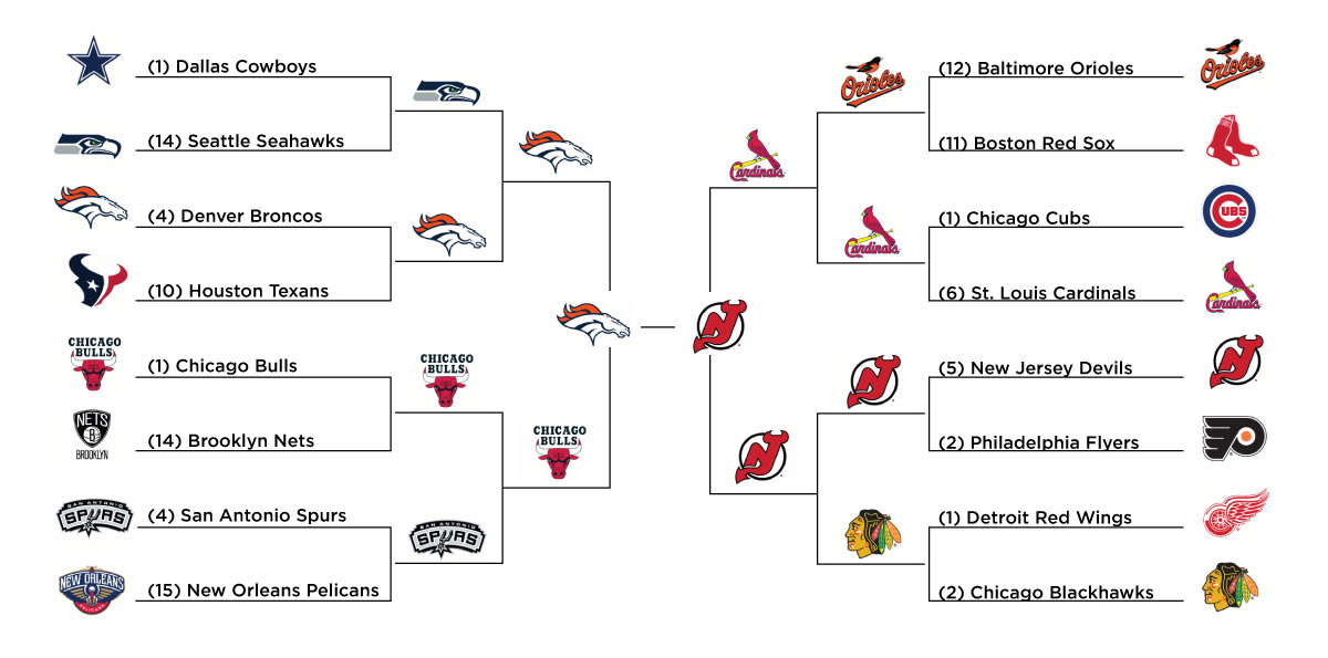
This is it. Down to the final two logos. We started with 128 logos representing the 4 major sports (in the US) and the finals consists of a team from the NHL and a team from the NFL.
The New Jersey Devils have had easily the best fan support to date, but they also have a very good logo. Named for a supernatural creature that has allegedly roamed the Pine Barrens region of southern New Jersey, The Devils’ logo is a monogram of the letters “N” and “J”, rendered with two devil horns at the top of the “J” and a pointed tail at the bottom. The monogram is red with a black outline, and sits inside an open black circle. The logo lies on a field of white in the middle of the chest on both uniforms. The logo was actually designed by the wife of the Devils’ first owner.
The Denver Broncos logo is relatively new in the grand scheme of things. The organization has had several redesigns over the years. In 1997, they debuted this version that’s comprised of a bronco head with an orange mane and navy blue outlines. The energy and momentum in the illustrative lines is what I think is what makes this logo great, not to mention the implied notion that it will kick its opponent’s ass. The logo was designed by Team Sports, a division of Nike.
To read how we got to this finals you can start from the original post and go round by round.
So, who do you think has the better logo? This voting will span the entire month of October ending on Thursday Oct 31st. We will keep results hidden until then so make sure you vote and share with your friends and/or fellow fans to get the word out.

