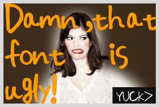
Designers Reveal Their Least Favorite Fonts
WANT TO SEE MORE LIKE THIS?
Sign up to receive an alert for our latest articles on design and stuff that makes you go "Hmmm?"

As a designer, I often notice things that others may never notice. Ligatures that are misaligned, kerning tables that are not spaced properly, and terrible number glyphs that don’t match the alphabet styles.
These “aesthetic details” may go overlooked by many… but to someone who cares about design—an obnoxious font can drive you crazy.
So I asked a few people, who are all entwined in various degrees in the design community to name their least favorite font(s). What we got in return is quite amusing and certainly better than a list of the 10 worst fonts. Although, many of these clearly would be in the fonts Hall of Shame.
Responses to: “What’s your least favorite font?”
Matt Kuttan: Papyrus. Because it evokes thoughts of an Egyptian overachieving tweener girl trying to write on a foam board to vote for her for a Cairo middle-school president.

Jill Smokler: Comic sans is just tragic and overused.

Greg Hinkle: Comic sans. Obviously.
And Trebuchet. It’s an annoying Arial variant that Microsoft thought would be so cool, but just shows how shortsighted and megalomaniacal they are (since it only looks right on Windows PCs).

Amit Savyon: WingDings!

Stuart Cohn: Whoa, only one? I think half of the stock decorative fonts that are the default fonts on your computer.
These are cop-out fonts:
- Comic Sans
- Papyrus
- Jazz
- Party
- Mona Lisa
At one point they might have been designed for ease of use for non-design community to develop notes cards, invites, etc., for the casual home user.
But over the years they have become staples to the uncreative, unimaginative and untalented set and they have opened the door to mediocrity to become common place.
It has contributed to anyone with a computer to think they can be designer or art director etc.

Frank Oros: Franklin Gothic. In college I learned to set type by hand –– metal castings placed individually into galleys. A painstaking and laborious process. I was late on a particular assignment and was rushing to set the type. I picked Franklin Gothic because it’s my name (no, not Gothic), and because I figured it was bold enough to carry ink adequately (what did I know).
After setting the type and adding slugs and such I threw in some pictorial elements to fill space and hurriedly began to bind the “chase”, the form that ends up on the flat bed. The chase is bound under tremendous pressure to hold all type, slugs, pictorial elements, etc. together. You shouldn’t rush this process because if the elements aren’t aligned perfectly they’ll literally explode out of the form and you’ll have “pied the chase” as I believe it’s called in type setting circles. I rushed it. It ‘sploded. I spent hours after class searching the cruddy press floor for hundreds of castings, cleaning them and rearranging them in the job case under the wary eye of my humorless professor. I hate Franklin Gothic. It performs poorly under pressure.

Mike Segawa: I honestly hate-with-a-passion the “Chicago” font. Mainly because Chicago’s my favorite city, and it’s already got a reputation for being an underrated city, it sucks that a totally boring font is titled after my favorite city. And the negative space created is unflattering, except for the spot in the “a”. That’s my favorite part of this most hated font. If I could spit on it I would. Ptooie!

Alana Zussman: Comic sans makes me cringe! All the teachers and students use it in the school. The worst is it is the preset typeface on the programs they use.
I also can’t stand Curlz MT, Mistral (which was used everywhere in Amsterdam) or Zapfino. I don’t think they are appropriate for any subject.

Eric Liao: For me, it’s hard to pinpoint a particular font I don’t like. It all depends on the context in which it’s used. I feel like almost any font has it’s “place” in the design world depending on the brand or the messaging. But if I had to choose, I’d say script fonts like Mistral. These fonts are meant to mimic natural cursive handwriting, but unless you get the right letter combinations and the perfect kerning, it won’t look natural. For example, starting a word with a lowercase “t” or “o” using Mistral will look odd, because these letters were designed to be connected to another letter that precedes it.

Ian Whitmore: Impact — Because it makes no impact on the viewer whatsoever and at certain sizes it borders on unreadable. The lowercase ‘p’ in Impact is one of the more awkward and repulsive letter forms I have seen.

Phil Adams: How about the most pretentious face ever designed? Has to be Avant Garde; so hot at the time but now—maybe it should be re-named Passe.

Eduardo Nieuwenhuyzen: Curlz—just makes me think of people using multiple colors with each letter. Oh yes, and freakin’ confetti! I hate confetti.
Octane Super is an example of fonts using too think of strokes making readability almost impossible. Etiquette is just just wrong, themed fonts should work harder than that. But then again I hate themed fonts.
But the winner—Sand Bureau. Looks like someone with a mental handicap drank too much Redbull and used some the generic type building kits to make a font set. YIKES.

Tracy Camparone: Ok, I despise that scripty font that some people use in their email signature (which they think makes them look official), makes me cringe!

Steev Szafranski:
Dear Papyrus,
You are the worst. Your dizzying scale shifts and roughed edges make me feel bad inside. Anybody looking to recreate a parchment map of Frodo’s journey through Middle Earth, please use traditional calligraphy and let this font slowly fade from our collections.
*No offense to Chris Costello, the designer of Papyrus. All in good fun.

Meg Cronin: I hate comic sans. It makes me nauseous, I’m not in kindergarten, and there is nothing comedic about it.

Kim Volk: Stencil. Something about it reminds me of getting bills in the mail. Depressing…

Keith Glantz (me): This wouldn’t be fair if I didn’t include my all time least favorite font. So, drum roll please…..
COPPERPLATE.

Curious choice, you may say. If you are thinking, ‘that font is okay,’ or ‘I kinda like it’… you are entitled to your opinion (although poor). I must tell you that when I see that font, all I see is the letters LAZY replace whatever message was intended to be read.
Copperplate has spread like a virus. People think they are “smart” or “sophisticated” when they use it. Or for that matter “official looking” with its all cap glyphic serifs. It’s often a default font on many computers who pretend they are designers.
Really people—this font is embarrassing. Do the rest of the world a favor and please refrain from using this it for any reason. In my opinion, if you have ever used this font on a wedding invitation, you are increasing your odds of divorce. Seriously, anyone who agrees to use that font is bound for failure.
On a side note: Copperplate was originally designed by Frederic Goudy. His other known font, Goudy Old Style, is rather nice.

What is your least favorite font? We would love to hear, so comment below.
Follow Us on Twitter