Controversial Logos
WANT TO SEE MORE LIKE THIS?
Sign up to receive an alert for our latest articles on design and stuff that makes you go "Hmmm?"

In certain circumstances, controversy can be a good thing for a brand. Press surrounding controversy often creates excitement, gets people talking and increases brand awareness. However, controversy is not guaranteed to benefit a brand. It can easily backfire, creating more damage than good.
Logos are one of the most important and effective ways to market a company or product image. An appropriate and clever design can amplify brand recognition, help tell the story and create an identity that resonates with consumers. A logo can essentially make or break a company. Thus, it’s crucial for designers to be mindful when crafting a new logo so that its meaning will not be misinterpreted or subject to controversy.
History has witnessed the criticism and debate over several famous logos… some of which we’ve decided to share here.
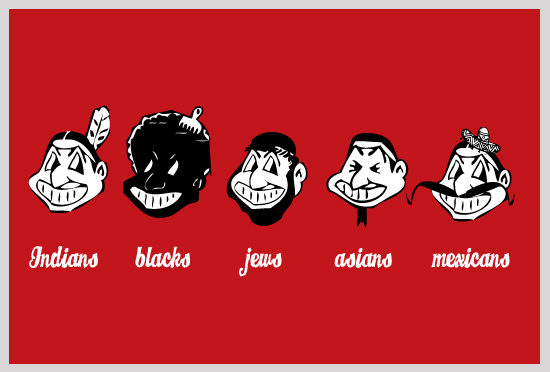
In honor of Thanksgiving, we’ll begin with the surplus of Native American logos that have been largely controversial in sports history. Some of these scrutinized team names and logos have been ordered to change due to their offensive nature.
Here’s a quick rundown for those who slept through American History…
Native Americans were exploited from the moment Europeans first arrived in America. They were driven from their land, their homes and confined to reservations that are now common across the South and Midwestern parts of the United States. When sports teams began creating names, logos and mascots to represent them, many drew inspiration from the Native American culture. In effect, there has been backlash from groups that see these team names and images as demeaning to native traditions, and perpetuate a negative stereotype.
Among those teams that have names derived from Native American references include, the Chicago Blackhawks, Chief Illiniwek of the University of Illinois, Chief Wahoo of Cleveland Indians, and the Washington Redskins (just to name a few).
Chicago Blackhawks Logo

The NHL’s Chicago Blackhawks use a Native American’s profile on their jerseys. The team was named in honor of the team’s founder’s military unit, which was named the “Blackhawk Division” after Black Hawk, a Native American chief.
Although some argue the current logo is offensive, knowing the origin behind the team name makes it a difficult case for those deeming it racially insensitive. If you ask me, the current Blackhawks logo is much less offensive then some of those from the past.
Chief Illiniwek Logo

Chief Illiniwek, the former athletic symbol for the University of Illinois, has also been a victim of scrutiny. The logo was banned after being ruled “hostile and abusive” and was retired in 2007 to comply with the NCAA rule to no longer allow Native American imagery unless the specific ethnic group being portrayed gives their blessing.
However, the Board of Trustees of the University claimed the chief to be a dignified symbol and that his ceremonial dance was done with grace and beauty. Watch the Chiefs last dance.
Chief Wahoo of the Cleveland Indians

The Cleveland Indians have been around since 1901, and if you ask us, this is a drastic improvement from their much more offensive logo from the late 1940s. The Indian logo is more nostalgic than anything and for most, it is simply an image associated with that team. Still, some are deeply offended by the red-faced representation of an Indian that borders on racism.
Where do we draw the line?
Activists have been protesting the use of Chief Wahoo and the Indians for decades. But it hasn’t been changed yet.
Washington Redskins Logo

Used outside of sports terminology, “Redskins” is a radical term for those of Native American decent. But as a team name, is it meant to be offensive? Many people may not even know where the term “redskin” is derived from.
Back in the 19th Century when bounty hunters killed Indians for profit, instead of returning with bodies to prove their kill, all that was necessary was “redskin” which often meant a scalp, the genitalia of a man or the breasts of a woman. If this is what “redskin” means, obviously it’s not a positive word that shows respect to a Native American community.
On the other hand, a 2002 poll conducted by Sports Illustrated found that 75 percent of Native Americans polled had no problem with the team’s nickname, however, the lawsuits and appeals continue.
Some other pretty controversial Native American logos not mentioned here are Florida State Seminoles, North Dakota Fighting Sioux, and Central Michigan University.
And equally not forgotten, although not Native American are Aunt Jemima and Ole Miss.
On a lighter note, here are some other logos that have been subject to debate…
Olympic Logos
London 2012

Designed by Wolff Olins for a whopping £400,000, this terribly ugly logo was received with overwhelmingly negative criticism. 80% of people who participated in a BBC online poll gave the logo the lowest possible score. Others complained that the logo was so horrible that when seen on TV it was causing epileptic seizures.

Iran threatened to pull out of the games, because they saw the logo as racist claiming it spelled “Zion”, or worse some people argue that the logo was derived from the Nazi symbol and can spell out “Nazi” and contains elements of the Swastika.
Montreal 1976

The Montreal 1976 Olympic Logo was apparently supposed to represent the letter “m”, a podium, and a running track. Hmm… since when does an “m” has 3 humps? Some people have scrutinized this logo claiming that it resembles a derogatory hand gesture. Learn more about the thought process behind how this logo was created.
Beijing 2008

The logo for the 2008 Summer Olympic games in Beijing, China, was created to look like a running figure triumphantly crossing a finish line. However, some Chinese correspondents found the figure offensive stating that it looks weak and that the legs are soft and limp as if bowing down to a master.
Corporate Logos
Apple

Apple’s company logo is an apple with a bite taken out of it. Some claim this signifies that the eating of the forbidden fruit (which was symbolically an apple) by Adam and Eve in the Garden of Eden was a good thing. Occultists teach that taking a bite out of the apple gave the first two humans knowledge, to lead them to self-divinity and godhood, which is otherwise widely thought to have been a negative action for giving into temptation.
BP

A few years ago, BP decided to go through a re-branding. As a “Beyond Petrolium” company, they gave themselves an innocent “green” logo (shown on the left) which does not fit very well with their intention to do business in tar sands and deepwater drilling. Controversy arose over this new logo, as many people were not buying into their new image, regardless of how well designed it is. Greenpeace UK asked it’s activists to create a new logo (one example shown on right) which really shows BP’s “predatoty nature.”
Comedy Central

Comedy Central cleverly created this ‘C within a C’ to logo. Some may not even recognize its genius twist on the copyright symbol. See. It’s turning corporate America on its head. Hilarious.
Starbucks

Some customers were dissatisfied with the new, simplified Starbucks logo. This goes to show people don’t like change. How will they ever find their way to their favorite bean chain with no “Starbucks” or “Coffee” on the logo? All of this fuss was for nothing. Now the logo has been reduced to the three most important elements: the circular shape, the siren and the “Starbucks green.” They could probably just use a green circle and people’s mouths would start watering. Plus, without these labels, Starbucks can create more than just coffee.

There are a million other controversial logos out there and this list could go on and on… Anyone care to share?
Follow Us on Twitter