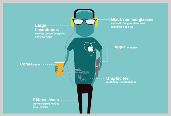
The Anatomy of a Graphic Designer
TOPIC
Inspiration
WANT TO SEE MORE LIKE THIS?
Sign up to receive an alert for our latest articles on design and stuff that makes you go "Hmmm?"
Are you a graphic designer?
Do you know one?
Do you think that this infographic accurately portrays the stereotype?

This infographic was one of a few fun posters for graphic designers. See the rest here.
You can buy a print of this poster here
Follow @keithglantz

Keith Glantz is the Founder and Chief Creative Officer of Glantz. A native New Yorker, he has called Evanston his stomping ground for 20+ years.